
Tags
additive color, Charles Blanc, color star, color theory, color wheel in flowers, Laceleaf Japanese Maple, Loropetalum, Oakleaf hydrangea, red and green plants, subtractive color
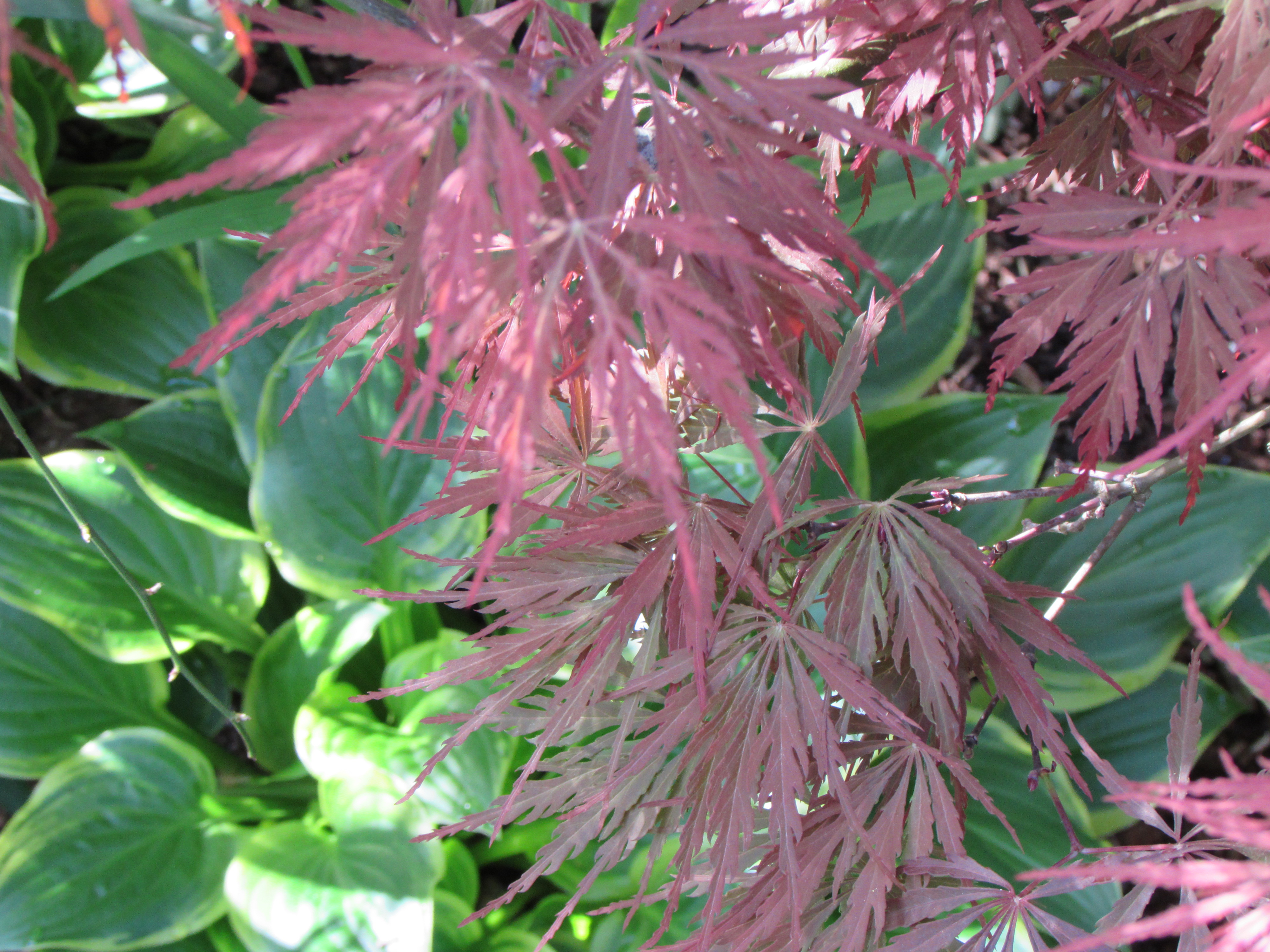
A striking combination of color and texture.
The theory of color can be a life-time study. As an art student and designer I have spent a great deal of time trying to understanding the different theories and the science behind them, hoping to incorporate the right balance in my work. I learned that how we achieve color on a TV or monitor is different than that on a paper or a canvas. They use what is called additive color, additive because new colors are formed by adding light from two or more light sources of different color to achieve a third color. In additive color mixing, if you adding all three primary colors together you get white light.
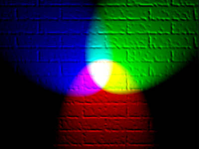
The traditional color star, used by artist since the 1800’s, was developed by the French art critic Charles Blanc. Similar to the color wheel you learned about in school for mixing paint. You remember if you put yellow and blue together you make green etc. The traditional complementary colors used by 19th-century artists such as Van Gogh and Monet are colors that are directly opposite each other on the star. Red, yellow and blue are the primary colors and green, orange and purple/violet being the secondary.

In painting we use what are called subtractive colors. Subtractive meaning starting with white light and adding colors from sources like paints or inks on a reflective surface, the colors subtract wavelengths from the light, giving you a new color. And in theory if you mixed all 3 primary colors together on the color wheel you would get black.

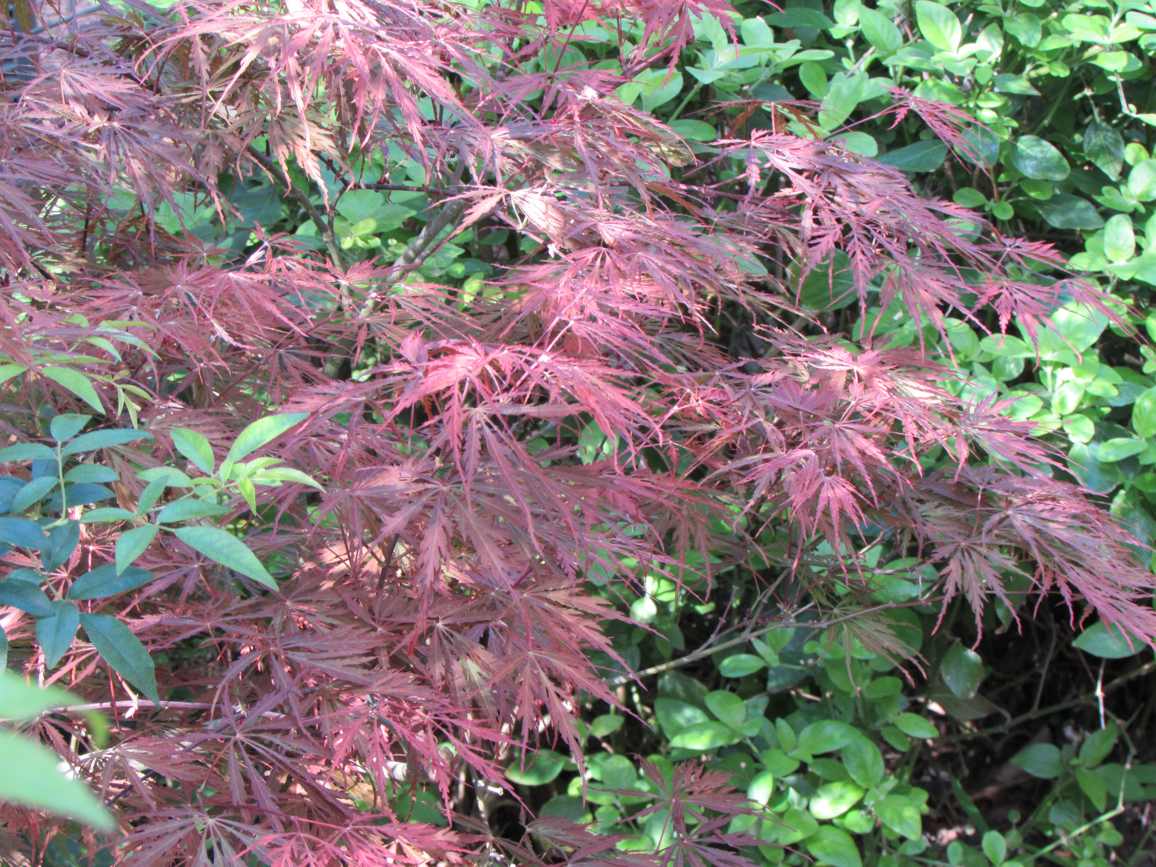
Color wheel in flowers.
The traditional primary–secondary complementary color pairs in the color star are red & green, yellow & violet, and blue&orange. Leonardo da Vinci felt the finest harmonies were between colors exactly opposed each other (retto contrario; which is what the primary-secondary pairings are). When you place these complimentary colors next to eachother in your garden (which are directly across from eachother on the color wheel) they create the strongest contrast and also reinforce each other creating stability. Remember when planing a garden that you have other colors that are constants the blue of the sky and green common in most plants.
Here are some photos I took yesterday with the combination of red contrated with green in my garden here at Ravenscourt.
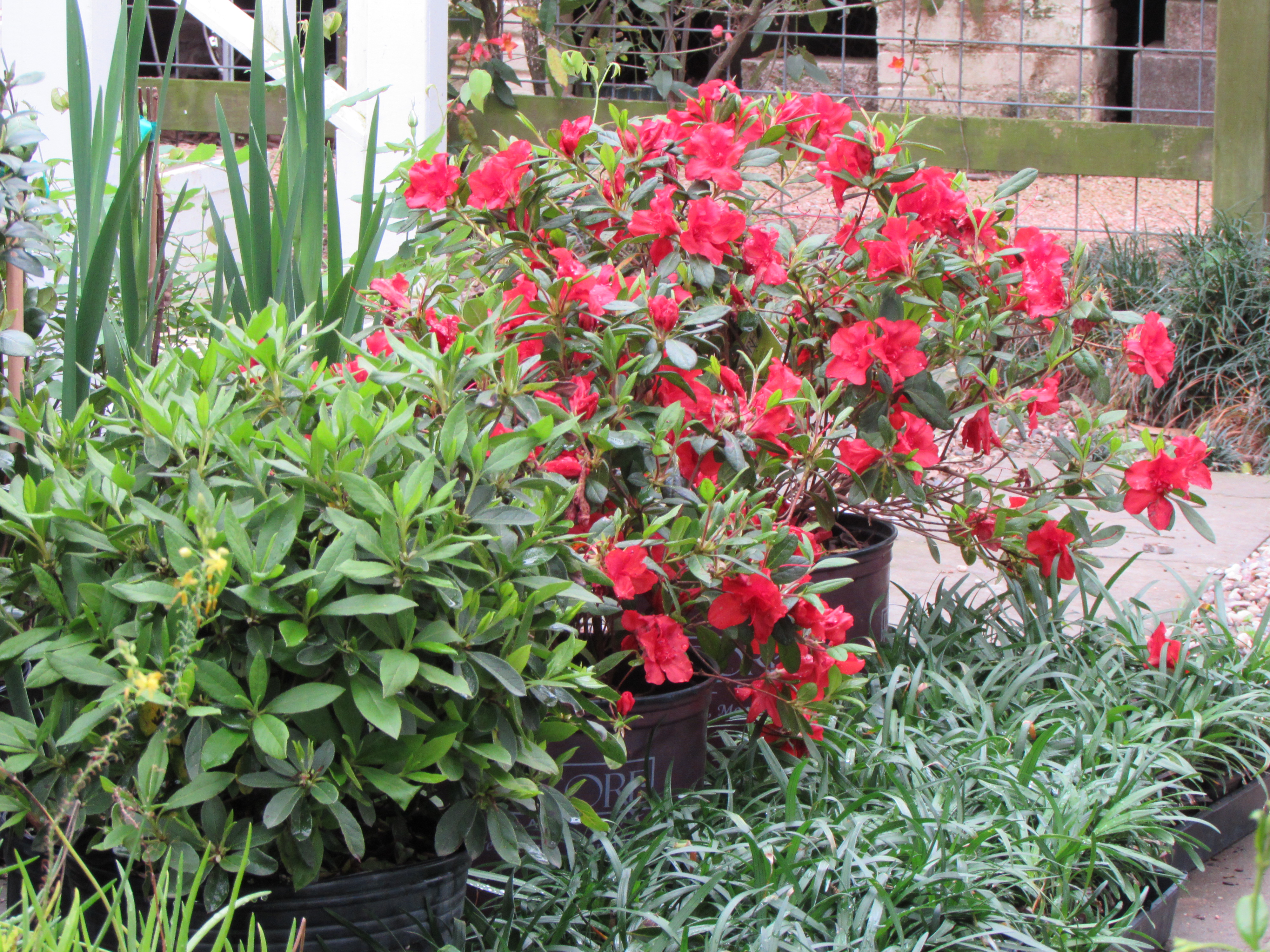
Autumn Ember encore azaleas waiting for their new home.
It is color in nature that interests me the most! I am not fond of certain combinations in say clothing or fabric that I would enjoy in a flower or leaf. As interesting as all the theory is I believe in the end of the day it is also about what appeals to you. Scientist are not even sure if we all see color the same, your purple might be my blue etc. I put a lot of stock in personal preference. I always ask my clients about color. It is part of our company questionnaire. And we visit it again while in their garden.
I love to plant a beautiful plant with a deep warm shade of red next to one with cool green leaves. Because flowers are often fleeting I look to the leaves when creating a design. For some reason I am very attracted to plants that have any shade of red in their leaves. I enjoy red flowers but not as much as leaves. The fronds of Autumn fern in the spring are a multitude of color…from rust to chartreuse. My laceleaf Japanese maples is stunning with its crimson leaves that will fade to green by summer. I like pairing plants with deep red or burgundy foliage next to plants with shades of lime green. The contrast between my oakleaf hydrangea and loropetalum is exciting even on a cloudy day. I would never wear a shirt with that much contrast but in nature it delights my eye with its dramatic contrast!
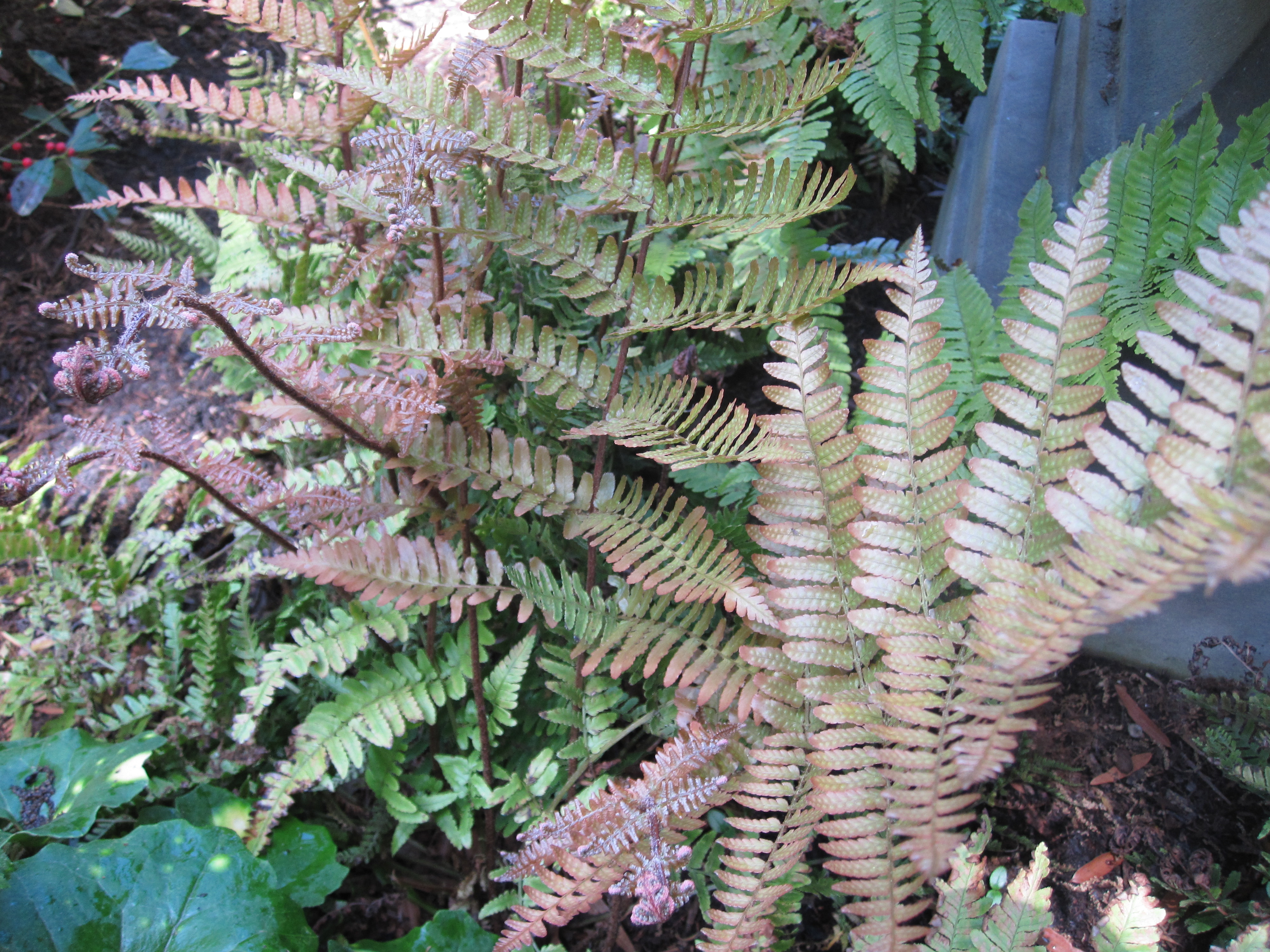
Autumn Fern in spring.
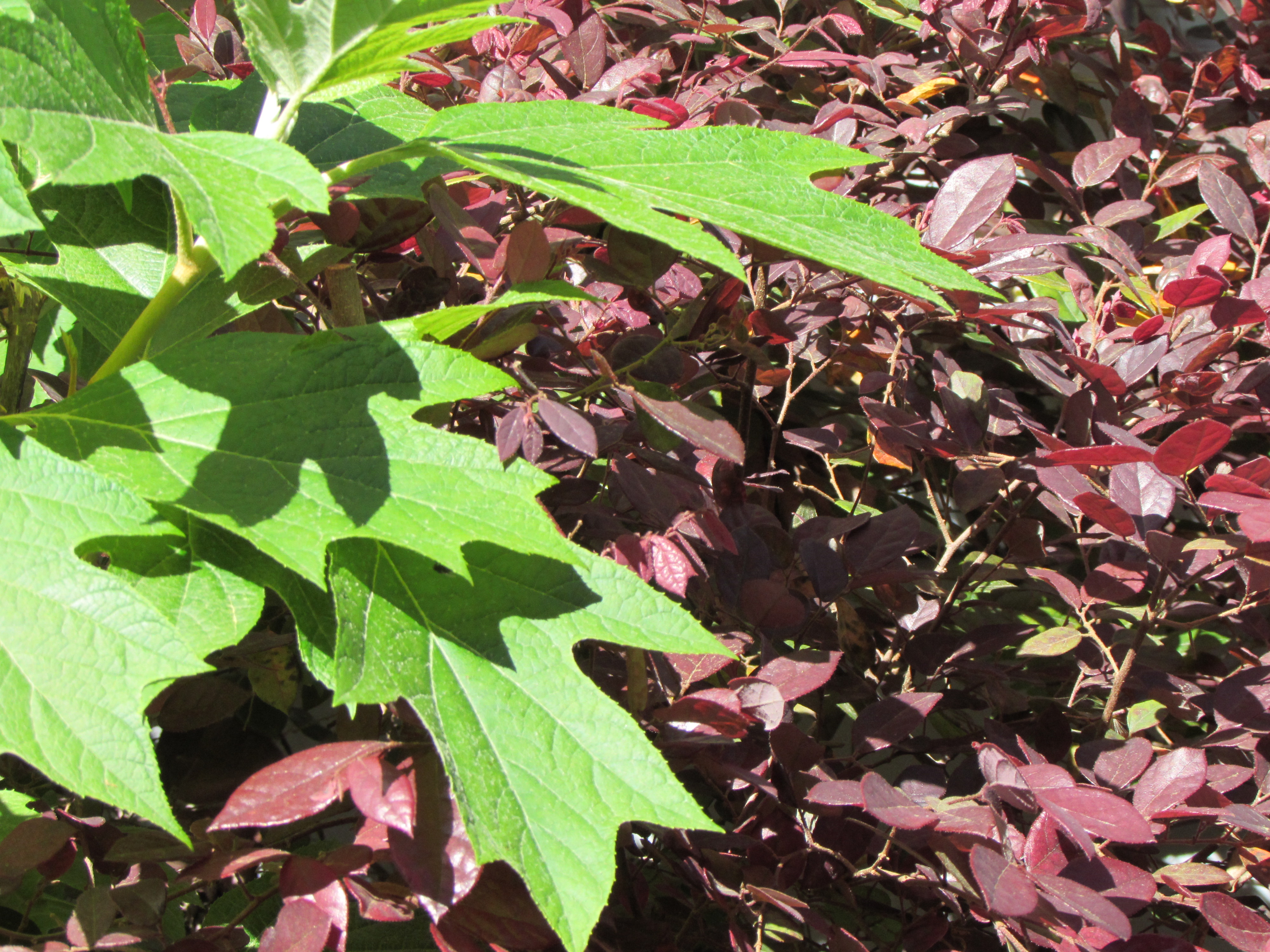
Oakleaf hydrangea and loropetalum.
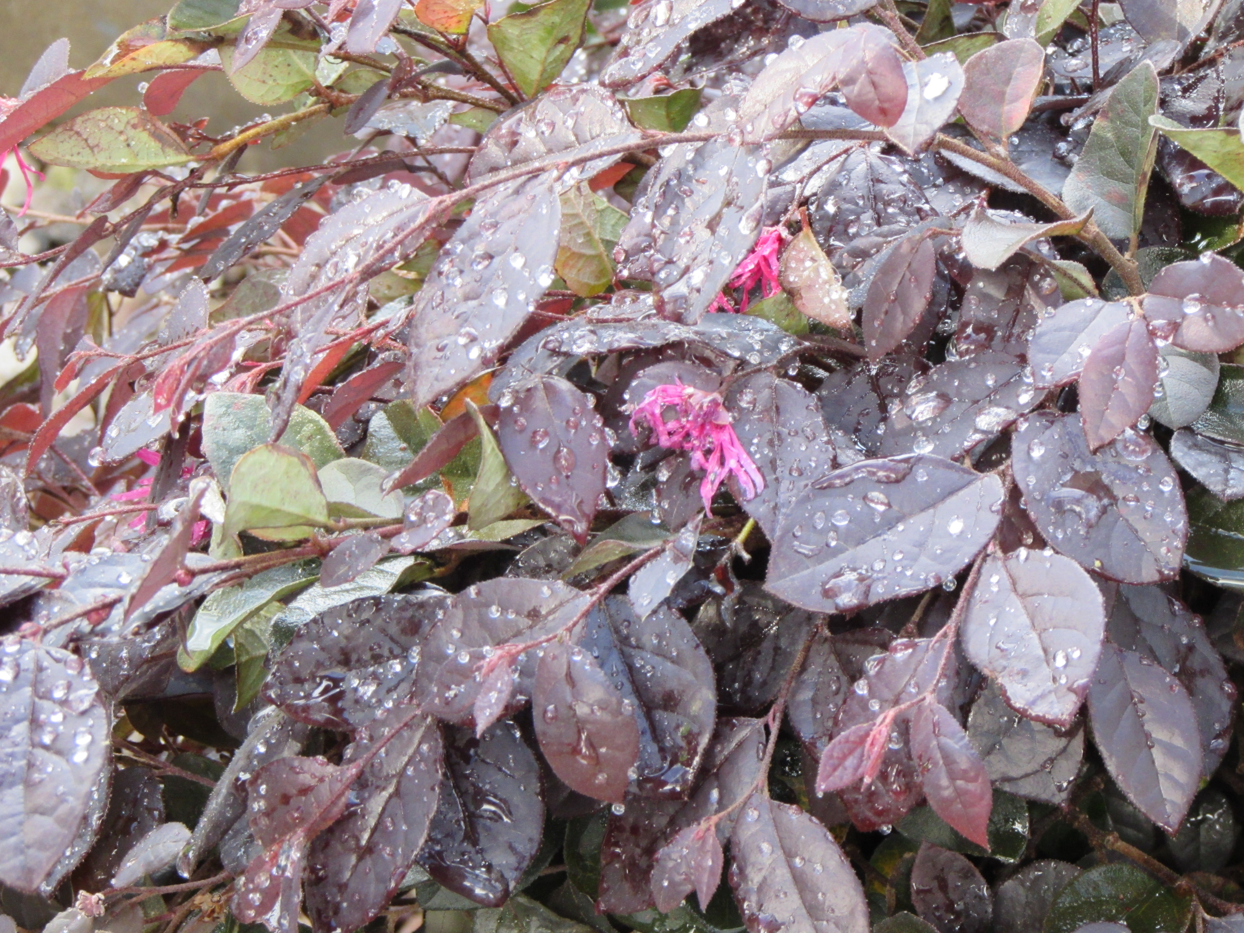
The underside of the loropetalum leaves are green; giving you contrast all in one leaf.

Begonias make a pleasing pop of color in a shady space.
And I am pretty sure I plant rainbow Swiss chard because I like the colors in the stems.

And they taste as good as they look.
How do you feel about the combination of hues of red and green?
For a bit more understanding of color combining in plants chick here : ) http://www.gardening.cornell.edu/homegardening/sceneccc7.html

To my eye green usually fades into the background. The exception is when there are ornamental grasses that have a dramatic shape and maybe movement. The other exception is when there are striking textures in a shady garden, for example ferns and gunnera. But generally when I see red my eye tries to search out another dramatic color: pink, yellow, orange, purple, or even blue.
LikeLike
Pingback: My favorite traditional southern summer plant for shade! | Ravenscourt Gardens